 |
Beyond Words
|
Bogged down by complex arguments?Mapping the ideas could let you take
in everything at a glance; and even see the edge of knowledge.
Bob Holmes
 BOB HORN likes to tell a story about a scientific meeting he attended
a few years ago. "A biologist got up to talk and the projector failed," he
says. "She said, 'I can't give my talk without the slides.' A thousand people
in the audience groaned. I was the only person who was excited."
BOB HORN likes to tell a story about a scientific meeting he attended
a few years ago. "A biologist got up to talk and the projector failed," he
says. "She said, 'I can't give my talk without the slides.' A thousand people
in the audience groaned. I was the only person who was excited."
No, Horn isn't a connoisseur of embarrassing moments. He was excited because
the speaker's misfortune was a perfect, though unplanned, example of how
words and images can become so tightly interwoven that neither can stand
alone. Indeed, Horn, a visiting researcher at Stanford University near San
Francisco, thinks text and pictures have become so interdependent that they
have become a language in their own right.
Horn believes this "visual language" will change the world. He says that
it is far more efficient at conveying complex ideas than conventional methods
of communication. Armed with the ability to read and write visual language,
we will be better equipped to cope with the "firehoses of data" that threaten
to overwhelm us today. Its big advantage is that it allows people to digest
in hours complex issues that might otherwise take weeks to understand.
But most exciting of all, visual language is a tool for mapping ideas. Horn
and others have used it to map out complex manufacturing projects, to chart
political arguments and to navigate the treacherous waters of scientific
and philosophical debates. Their charts allow
the viewer to quickly grasp the main points of a debate and its current status.
They even show the edge of knowledge-a feat that is impossible by other means.
"We're preoccupied by information overload, but we forget that information
overload is less a function of the volume of information washing past our
eyes than the gap between the volume of information and our capacity for
making sense of it," says Paul Saffo, a technology forecaster who heads the
Institute for the Future in Menlo Park, California. "Bob Horn is going after
big game because, if his theories work, they will help us make our sense-making
tools catch up with the volume of information washing over us.
The idea of combining words and images is hardly new, of course. Humans have
drawn pictures-and presumably talked about them-for tens of thousands of
years, far longer than they've known how to read or write. And over the past
two centuries statisticians, political scientists and business theorists
have developed a large repertoire of graphs, flow charts, timelines and other
methods to summarise complex data and procedures. But three changes have
combined to thrust visual language onto centre stage in recent years, says
Horn.
First, modern life has become more complex. People in fields as diverse as
manufacturing and science have a bigger pile of essential information to
assimilate and less time to do it in than their parents or grandparents.
That makes it crucial to provide efficient oveiviews that let people pick
and choose areas where they want more detail. Second, with computer graphics
now the norm, almost anyone can merge text and images into a polished-looking
document, no matter how clumsy they may be with an artist's pencil. And last,
the video culture has given people, especially the young, much more visual
sophistication and made them more receptive to receiving information in more
than just words.
"Visual language is being invented all around
the world by engineers and consultants and mathematicians. It's being invented
out of need, to express complex ideas," says Horn. The past two decades have
already seen the emergence of a new cadre of content-oriented graphic designers,
sometimes called "information architects", that specialise in finding the
best combination of graphics and words to convey information-for example,
in the explanatory graphics that now appear in many newspapers and newsmagazines.
But visual language is much more than just good graphic design, claims Horn-it
is a true language, complete with its own formal rules of syntax and semantics.
Most people already know many of these rules from years of experience with
visual media such as cartoons, television and the adverts in magazines. We
know to read down lists, that arrows can show the flow of time or ideas,
and that a series of concentric rings can represent a target. We recognise
the conventions cartoonists use to indicate motion, collisions, and emotions.
In short almost everyone already knows how to read visual language, says
Horn. All they need is to learn how to write it well.
Horn may go too far in claiming that this marriage of words and images is
a true language, says Talbot Taylor, a linguist at the College of William
and Mary in Williamsburg, Virgirna. In real languages, rigid rules of syntax
make certain arrangements of words-such as "Ate supper my I"-wrong and others
right. By contrast, the laxer rules of visual language say only that some
usages work better than others-a list that starts in the bottom right-hand
corner of a page is not as easy to read as a list that starts in the top
left-hand comes However, says Taylor, that doesn't detract from the power
of visual language. In fact, he says, the freedom from rigid rules is a good
thing. "I think it's a mistake to try to explain the creative power it has
in terms of the narrowly restricted communication power that language has,"
he says.
| 'The brain uses pathways to process verbal and nonverbal information .A person who gets information from both channels has an easier time linking up the pieces' |
There's no doubt that images can help text get its message
across. "There's a lot of power in integrating words and pictures. It really
can improve people's understanding," says Richard Mayer, a cognitive psychologist
at the University of California at Santa Barbara. A few years ago, for example,
Mayer tested how well volunteers could understand the workings of a bicycle
pump or a car's brakes from verbal descriptions alone, pictures alone, or
both simultaneously. People could recall details equally well from any of
the three types of presentation, he found. But when the volunteers had to
apply their knowledge-by answering questions about how to fix a broken pump,
for example-those given both words and pictures came up with about 50 per
cent more correct answers than the others.
That boost probably comes because the brain uses different pathways to process
verbal and nonverbal information, says Mayer. A person who gets information
from both channels at once has an easier time linking up the pieces into
a meaningful whole.
Because of this, visual language works better for some kinds of information
than for others. "It's best at being able to grasp things in context and
see how they're related," says Terry Winograd, a computer scientist who directs
the Program on People, Computers, and Design at Stanford University. "It's
correspondingly less good at precision and detail."
Indeed, for many overview tasks, visual language is already so commonplace,
it's unremarkable. "When you sit down in your car, you don't read a bunch
of text. In the cockpit of a jet, you're reading enormous amounts of data,
but it's all visual" says Eric Oksendahl, who directs the design of instructional
materials for the Boeing Aircraft Company in Seattle.
One of the big advantages of such an overview is that it allows people to
see a complex subject in context and focus on whatever bit might be of interest
at the time. "We just don't have time to read everytliing," says Horn. "I
think that's an important principle for communications in the 21st century.
People should have the opportunity to scan and skip."
The strongest example of this is an overview technique Horn calls "argumentation
mapping"-the charting of ideas. In this, mappers gather together all the
arguments on a given question; together with their rebuttals, counter-rebuttals,
and so on, and lay them out on a giant flow chart. Anyone looking at the
map can see at a glance which branches of the argument have spawned the hottest
debate. And by looking more closely at the terminal twigs of a branch, one
can see who has had the last word so far and what they said.
Thorny question
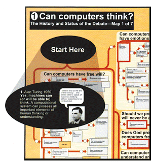
As an example of argumentation mapping, Horn and his colleagues have tackled
one of the thorniest questions in the field of artificial
intelligence: can computers think (see chart )? "My demand was that we
do it with an industrial-strength example, not some little toy," says Horn.
He started with mathematician Alan
Turing's bold claim in 1950 that machines will be able to think someday.
Then he and his mappers-three graduate students in philosophy-dived into
journals and books to trace the fierce arguments that followed.
In the end, their project turned out to be anything but little. Horn estimates
that his team laboured for 7000 hours over five years to create the map,
which runs to seven wall charts over a metre wide and catalogues over 800
individual points raised by 400 scholars. "It took a couple of years to perfect
a smooth read of these maps," he says. The next project (Horn has a grant
to map "What is consciousness?") should go much
quicker, he says, now his team knows how to go about their task.
Along the way, the mappers discovered another benefit of the process: that
the issues became clearer as they charted them. "The discipline that this
kind of summarisation and diagramming provides makes the differences [between
positions] emerge more clearly. In prose it's very easy to fudge or be slightly
ambiguous. It's very difficult to get away with that in this kind of
methodology," says Horn.
In practice, the charts provide a good example of both the strengths and
weaknesses of mapping ideas. "On the one hand, the
maps simplify the positions, so they're not as effective
in giving you the nuances," says Peter Suber, a philosopher at Earlham College
in Richmond, Indiana, who uses them in his class on artificial intelligence.
"But on the other hand, articles and books can't convey all the connections
with the same clarity and speed."
Indeed, Suber thinks similar maps may be useful far beyond the
arid halls of academe, in the decidedly steamier
thickets of politics. "Kosovo is a good example of a topic that has probably
lost a lot of the public," he says. "A map of this sort would show people
what the disputes are. The problem would be getting the maps in front of
the people who could do something."
Others are already planning to use the maps to guide policy. In Calgary,
Alberta, a group of futurists called the Capitalizing on Change Project will
spend the next year or so developing a map of the argument over the role
of carbon dioxide in global climate change. "That argument has lots of ideologues
and often not much clarity," says Ruben Nelson, who heads the project. "We're
hoping that by developing an argumentation analysis we can help people stop
hyperventilating and get clear on what things they disagree on, and which
of those are factual and which are
emotional issues."
The best thinkers of every generation have been able to keep such an overview
in their heads, Nelson thinks. Putting that overview into a concrete form
could give more people the same advantage and bring more voices into social
debates. "I call it the language of complexity"
says Elsa Porter, a management consultant in Portland, Oregon, and a former
assistant secretary of commerce in the US government. "It's the first time
we've had a grammar and a syntax that allows you
to speak the language of complexity in a way that ordinary people can understand.
Eventually, I imagine, you could have a conference on an issue, say reduction
of teenage pregnancy, and as people talk about all the causes and effects,
you could use the computer to put a map on the wall. Then people would really
see and understand the causes and effects and
what to do about it."
There are a few hurdles to clear before Porter's dream becomes a reality
however. For starters, anyone without bucketloads of money will have a hard
time even getting hold of a high-resolution computer display the size of
a wall, let alone a "live" one that records what they write on the display.
The laptop-driven projection displays that are now commonplace in lecture
rooms merely enlarge a standard screen, which does not give enough resolution
to display more than a corner of a large map. A few companies have begun
marketing projection systems that can process more detailed live images,
but they cost many thousands of dollars. "How soon will we routinely put
a blackboard-sized live screen in our offices at a sensible cost? Probably
ten years down," says Saffo.
Undoubtedly, the biggest challenge is to find a way of writing visual language
quickly. "We have not even begun to build software tools to help us do this,"
says Saffo. Working with text and images together in existing computer programs
usually involves carefully defining text and graphic elements and positioning
them-not exactly an effortless process. "You don't want to spend your time
planning how to make the information appear. You want it to just flow," says
Winograd. "If you watch somebody who's good at [visual language], they would
be better off with - something that felt like sketching with a pen than like
placing something with a draw program.
| 'Undoubtedly,the biggest challenge is to find a way of writing visual language quickly' |
Writing freehand
Already there are hints of such an approach. Popular programs such as
Power-point include tools for producing tree diagrams and organisational
charts quickly. And a program called SKETCH, now under development at Brown
University in Providence, Rhode Island, recognises simple strokes of the
pen and fills in appropriate detail.
If the user draws three edges coming from one corner of a box, for example,
the program will complete the box. Through a series of steps like this, the
program takes a rough freehand sketch and transforms it into a polished-looking
drawing, complete with straight lines, parallel edges, and so on.
But what makes SKETCH so promising is the next step in its processing. If
someone tells the program that it's dealing with furniture, the user need
only sketch a cube and the program fills in a fully detailed chair; for a
rectangular box, it would fill in a table. If a different user tells the
program that it's dealing with computer hardware, it would fill in similar
sketches with different detailed objects. The techniques for doing this are
well advanced, says Robert Zeleznik, the computer scientist who heads the
SKETCH team. "In many cases, it's just a matter of spending the time to flesh
out a complete database of components," he says. Eventually, they hope to
add voice recognition so that the user can say "Windsor back" or "Chippendale"
when sketching the cube and thus specify not only a chair but the exact style.
Zeleznik and his colleagues have not yet tried to apply SKETCH explicitly
to drawing out visual language, though Zeleznik agrees that "that's a direction
you could go along". However, Winograd and other experts think it may prove
to be an excellent starting point.
Even if hardware and software developers can clear all these technical hurdles,
visual language faces another barrier: most people can express what they
need to say much more quickly by
writing plain old
prose than by constructing an elaborate information graphic. Even Horn
admits that he could have covered the ground of "Can
computers think?" in far less time if he'd simply written a book.
Of course, speed isn't everything-one can
write bad prose even
more quickly than good prose, for example. For many uses, such as instruction
manuals or the executive summaries of business and governmental reports,
writers may find that visual language gives them better clarity or greater
mass appeal that is well worth their extra time. A quick glance at any glossy
magazine shows that most advertisers already think so.
| Further reading: Visual Language by Robert
E Horn, MacroVu Press, Bambridge Island, Washington, 1998. Information
Architects: The Design of understanding, edited by Richard Saul Wurman,
Graphis Press, 1996. You can get more information about the argumentation
maps and Horns book at www.macrovu.com |